Reporting vs Performance Analytics: What's the Difference? Part Three
Updated: 18th Oct, 2022
Welcome back to Part Three of our Reporting vs Performance Analytics: What’s the Difference? series, where we help you understand ServiceNow reporting and how it weighs up against the Performance Analytics application. In Part One, we talked about the capabilities that standard reporting offers, while Part Two looked at how Analytics Hub and pre-requisite calculations come into play.
As a reminder...
Key takeaways from Part Two are that Analytics Hub unleashes key potential for users of Performance Analytics. PA is also not necessarily where you should go for ANY advanced calculation, because some measures may be enabled through reporting with other prerequisite data steps. Examples of these include SLA definitions, formula fields, custom fields, database views and custom tables, as well as metric definitions.
How does ServiceNow bring data together in responsive dashboards?
ServiceNow homepages are a thing of the past and have now been replaced by responsive dashboards that support both Performance Analytics and report widgets. Whilst the Tokyo release also introduces lots of enhancements to Next Experience dashboards, we’ll reserve that for a separate topic - look out for us talking more about that very soon.
Performance Analytics widgets are generally more flexible than reports due to the nature of being able to choose a specific indicator and select the period that you want to focus on. Whereas when adding reports, these need to be prefiltered for the period that you are reporting against (unless using date/custom interactive filters). This can result in you needing to create multiple reports – one for last month, another for this month and so on. This is especially true if you are intending to create a dashboard which uses two reports on the same table but based on a different date field. For example, ‘Incidents Created’ vs ‘Incidents Resolved’ side-by-side in the same tab. When adding report widgets, there is no distinct relationship setting today that defines which date field each report is bound to.
As well as looking more aesthetically pleasing, Performance Analytics widgets offer additional visualisation options and functionality, such as the ability to create workbench widgets that allow you to dynamically interact with the dashboard.
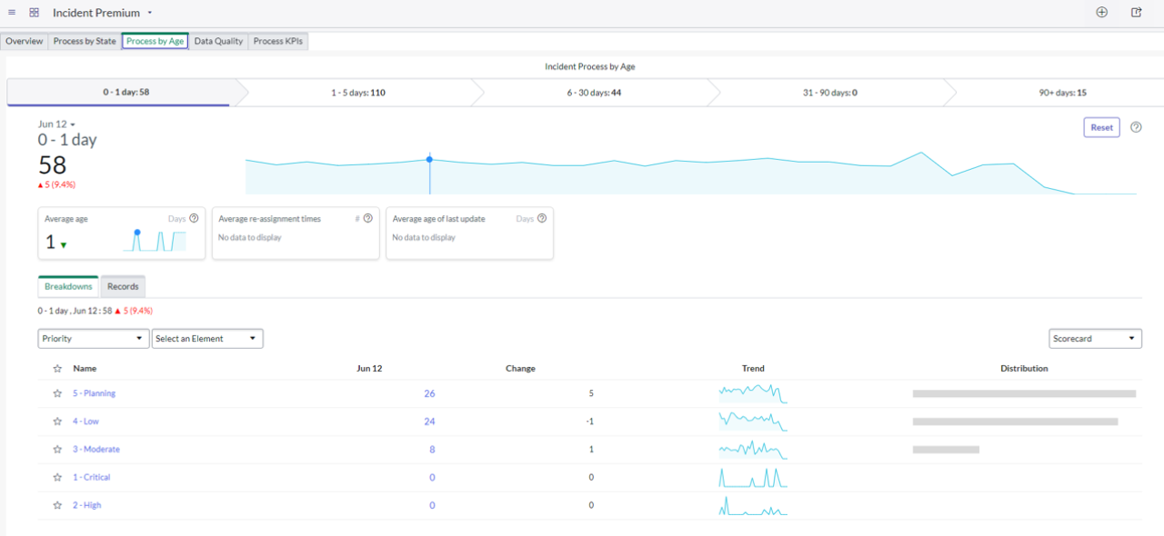
Example Performance Analytics workbench widget
That’s not to say that all responsive dashboards should be created based on Performance Analytics data. Reporting certainly still has its own place and there are plenty of reports that can be created to enable effective dashboards. At Unifii we were able to create a whole range of meaningful SLA/OLA/underpinning contract based dashboards with reports alone, as part of our ITSM reporting suite.
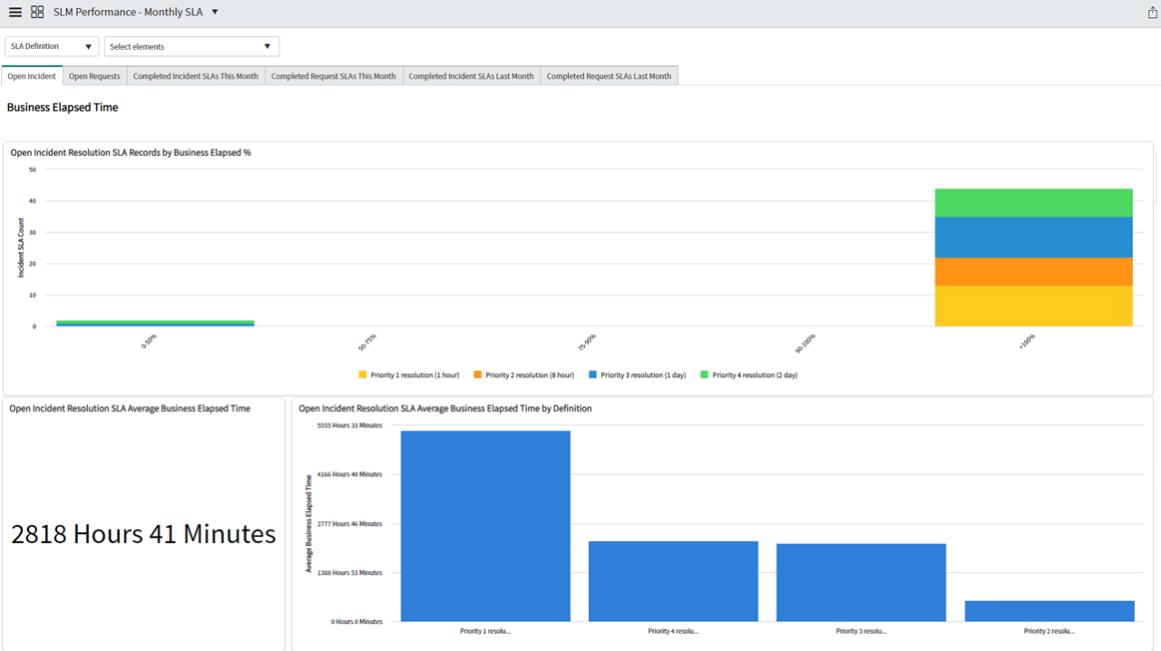
Example responsive dashboard utilising reporting widgets
Which filtering capabilities do I have in responsive dashboards?
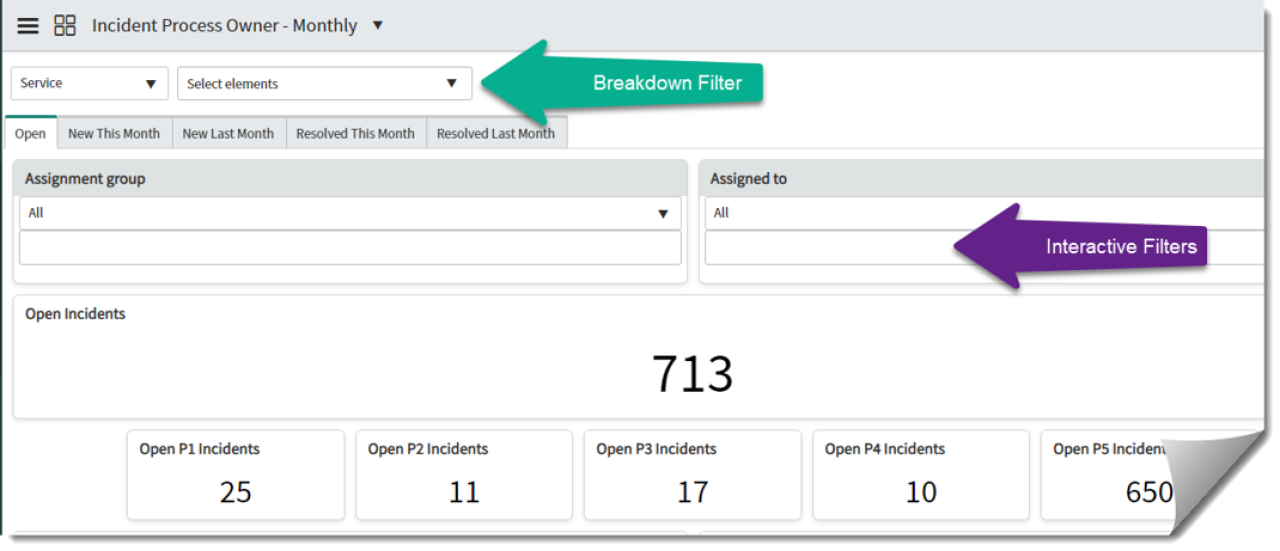
Responsive dashboards offer two types of filters: breakdown and interactive.
Example of breakdown filter positioning vs interactive filter on a responsive dashboard
Breakdown filters always sit at the top of the dashboard, and typically run across all dashboard tabs and all applicable widgets. We always think of breakdowns as being your “jumping off point.” If you have a dashboard targeted at a Service Manager persona, then perhaps your core breakdown is “Service,” whereas a dashboard targeted at a Programme Manager persona may have the core breakdown as “Project Manager.”
Breakdown filters are typically aligned to the PA Breakdowns that we discussed earlier. Conveniently, we can also map breakdowns to interactive filters so that we can use this jumping off point for dashboards entirely comprised of reports.
Earlier, we discussed the breakdown limitation for Performance Analytics where we said a maximum combination of two breakdowns can be used simultaneously. However, this limitation extends slightly further when applying Performance Analytics widgets specifically to a responsive dashboard.
Whilst dashboards can have more than one breakdown applied to them, it’s important to understand that within responsive dashboards, only one filter can be applied to a dashboard at any given time.
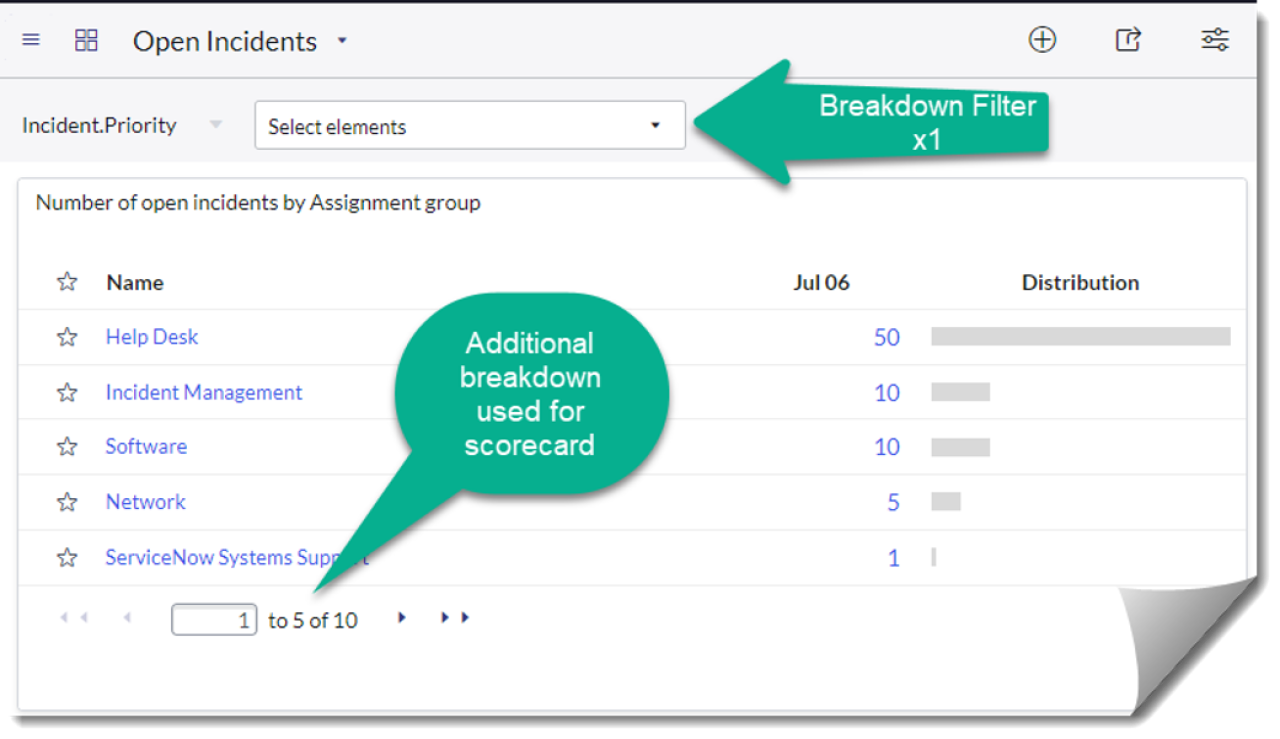
Example of breakdown filter positioning vs interactive filter on a responsive dashboard
If the application allowed you to filter for two breakdowns at a time, with the maximum limit already reached, you would be unable to create additional visualisations such as the one above. The widget is relying on utilising that second breakdown dataset.
If you know that your dashboard is going to only be comprised of PA widgets without any breakdown visualisations, you should be aware of this important limitation to the responsive dashboard capability where you will only be able to filter against one breakdown field.
Breakdown filters support the ability to choose single-select values as well as multiple select, but it’s worth mentioning that not all PA widget types support the multiple selection feature. In particular workbench widgets, or widgets based on formula indicators, are known to have their limitations.
We’ve covered breakdown filters, so let’s now talk a little about interactive filters. Unlike breakdowns that are limited to a single choice option, the good news is that we can add many interactive filters to a dashboard. Assuming the data mappings are correct, you can apply them simultaneously to achieve multiple reporting levels.
Whilst breakdowns can be used by both Performance Analytics and reporting, interactive filters are designed for reports only and cannot be used to control Performance Analytics widgets.
Let’s put that into context. If you have a requirement to create a dashboard that allows a Service Manager to pick their service, filter for priority 1 incidents, select an assignment group and then see results by location, reporting is the way to go as Performance Analytics does not support this many filter combinations.
The downside is that if your requirement included KPIs such as those that are percentage based and only achievable by Performance Analytics, we find ourselves in a catch 22 situation. As a result, sometimes sacrifices and resetting of expectations need to be made.
This can all get a little confusing so let’s try to summarise in the below:
Responsive dashboard filtering capability
Breakdown filter
Interactive filter
Applies across all widgets across the whole responsive dashboard
Yes - if the widget supports it
No - these only apply to the tab they are placed on
Applies to Performance Analytics widgets
Yes
No
Applies to report widgets
Yes
Yes
How many can be added?
Multiple
Multiple
How many can be applied concurrently?
One
Multiple
Breakdown vs interactive filter capability matrix
I noticed a lack of a time period/aggregation selector on the dashboards
At Unifii, we’ve spoken to many customers who have told us that they’d like to see dashboards adopting a similar calendar and aggregation selector to the one that we see in Analytics Hub. It’s one of the most common questions that comes up, especially for customers that are accustomed to tools such as Power BI.
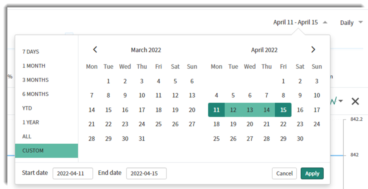
Analytics Hub date range selector
A default date and aggregator selector is not built into Responsive Dashboards today (even for those that only have Performance Analytics widgets on them), which means that whilst you have great flexibility within Analytics Hub, it’s only for a single indicator and not across a range of related metrics and KPI’s. As mentioned earlier, there is a level of date-range filtering that can be achieved through the use of interactive filters (but remember, these only apply to reports and not to PA).
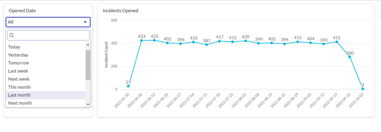
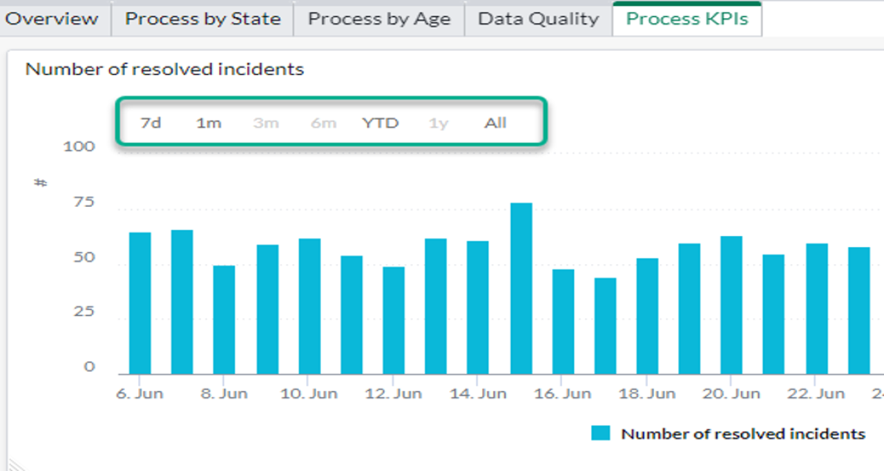
If your entire dashboard tab is focused on inbound volume, such as the number of incidents opened, a date filter could be added and mapped to various "opened" date fields in your process tables. Since all of your widgets are aligned to the same date field context, the single filter will apply consistently.
Interactive date filter applied to a single line chart showing the volume of incidents opened over time
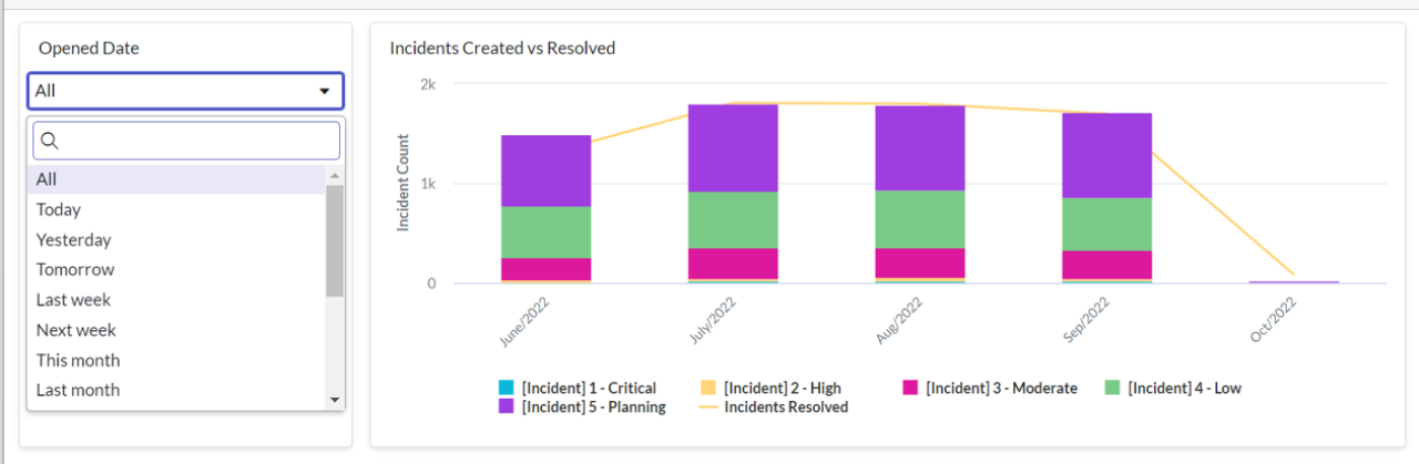
But if you have a use case such as the below where you want to display the volume of created incidents against the volume of resolved, the "opened date" filter will be applied to the resolved line also – something that you need to avoid.
Interactive date filter applied to a composite bar and line chart showing the volume of incidents opened over time
It’s important to highlight that whilst a level of functionality can be available to filter on the time period, there is no dynamic aggregation selector that will automatically change all time-series charts from grouping by month to grouping by day.
We’ve summarised some of the ways that we recommend working with the current capabilities, using responsive dashboards, below:
Utilise interactive filters for a time period selector - this can be great if your dashboard tab is focused on a specific date classification. For example, a tab that’s dedicated to closed incidents. You can use a date filter that applies a limit on the underlying report data for closed incidents in a certain timeframe. But if you have a dashboard that has a combination of data points on it, for example, created, open, and closed incidents all side by side, it will mean that your filters start conflicting. You can’t allow your closed incident reports to become filtered by someone selecting a filter based on creation date (and vice versa) so use these types of filters only if all widgets on the dashboard tab relate to a specific data point. Remember, interactive filters cannot be used on PA widgets.
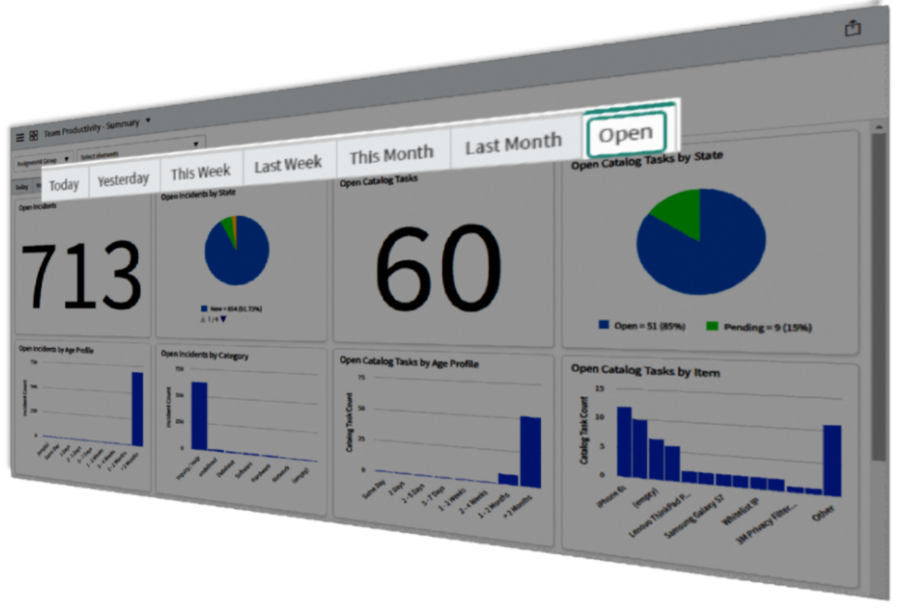
Create versions of each report for different time periods so they can be explicitly added as needed - whilst this does result in added overhead and a lot of reports, this is a solution that within Unifii we resorted to when creating our new ITSM reporting suite. For each master report such as "New Incidents," we created a specific version for ‘New Incidents Today," "New Incidents Yesterday," "New Incidents This Week," "New Incidents Last Week" and so on. We repeated this process for every metric and KPI resulting in dashboards that allow our customers to select the most common periods enabling faster insights and enablement of operational as well as contractual or audit reporting on past periods. This also allowed us to tailor time-series reports to be based on focused aggregations with monthly reports aggregating daily but quarterly reports aggregating monthly.
Example ITSM suite dashboard enabling different time focus within each tab
For Performance Analytics:
Most widgets for Performance Analytics are typically based on the “latest score,” but by using the time series configuration you can often make this work for you.
Today, there is no option for custom selections such as asking the widget to only display results for two months ago only.
There are also some specific exceptions where applying aggregation is not sensible. For example, if you are taking a daily snapshot of the number of incidents open, to report on the snapshot at the end of last month, there is no selector within the widget configuration that will give you this number. This may result in you needing to create an additional indicator that just runs once a month to give you that single day as the “latest score.”
Generally though, you will need to be specific as to what time period you want each widget to focus on. If you experience any obstacles, you might need to consider additional indicators to get the results you need.
Some widget types such as the workbench will enable additional flexibility by letting the user choose a different time period through interaction with the widget. Time series widgets, such as those shown here, can have a quick selector to flick between periods but applies to that individual widget only.
Time series widget showing a date range selector
So, ultimately...does my organisation NEED Performance Analytics?
At the start of this article, we talked about how Performance Analytics is not “Reporting Premium” and how PA and reporting are separate but complimentary products. This statement is emphasised when we consider how each product has their own set of limitations and capabilities, which sometimes makes it a bit of a juggling act to pick the best fit. Below, we’ve provided some key considerations to help make a decision on whether Performance Analytics is the right fit for your organisation.
If any of the below apply to you, we think Performance Analytics would be worth your time:
You want to improve the level of reporting standardisation
You have complex calculations such as percentage based KPIs and absolutely need ServiceNow to report on them
You need to trend data that is frequently changing such as open backlog
You need to compare results against global or individual targets
You need to be able to drill into a result and quickly interrogate breakdowns or different time periods and aggregations
You need to be able to add forecasting based on past performance
You need to be able to add comments to results at specific time periods
You need to be able to add external data or add manual indicator results
You need to be alerted of significant changes to performance through KPI signals
Of course, you should also ensure that you have the skills in house to configure and maintain Performance Analytics centrally (or have a ServiceNow Elite Partner like Unifii to help).
And crucially…
There are many types of advanced metrics that Performance Analytics alone will not solve. Make sure that you’re getting the most of your solution by considering reporting function fields, custom fields, database views, metric definitions and SLA definitions. Metrics and SLAs are there to help with the more complex types of measurement requirements to create data that can then be utilised by reporting and Performance Analytics. That requirement you might have to calculate the unique number of assignments a group had, that metric to calculate the average time between work notes being added to your tickets, or that KPI to track how often due dates are being pushed out, may not need Performance Analytics at all!
The fourth and final part of Reporting vs Performance Analytics will be an FAQ based blog, covering off any other questions you guys might have. As always, to learn more or just have a chat with us, please reach out to one of the team here.