Are you getting ready for Platform Analytics Workspace?
Updated: 2nd Dec, 2022
Have you had the chance to look at the new Platform Analytics Workspace within Next Experience? With this, ServiceNow introduces a concept change to reporting which organisations should start thinking about now.
Within the classic UI, there can often be several paths to configure what you need for your measurement requirements, which in turn makes the experience feel fragmented. To build responsive dashboards, we must first develop reports, add permissions, and then add them to a dashboard. For Performance Analytics indicator results, we need to create specific PA widgets. And to create filters, you need to prepare them in advance in a different area of ServiceNow. The point is, there's lots of different building blocks that need to be created and which all sit in different areas of the platform.
To help your organisation start thinking about its own adoption path for Platform Analytics, we'll be detailing some of the most important features that you should be aware of.
1. Reports, PA Widgets and Responsive Dashboards are becoming a thing of the past
Just like homepages were deprecated in replacement of responsive dashboards in the classic UI, the journey has begun to transition across to Platform Analytics for Next Experience.
Next Experience is moving away from the need to create separate reports and PA widgets by introducing “visualisations.” The visualisation designer allows you to pick data sources from individual tables as well as from PA indicators (and even user experience analytics data) to provide a single joined-up approach. The configuration is carried out in a single pane with dynamic options presented, depending on your selections. Whilst there is sometimes an element of configuration in pop-up windows, the designer experience is much improved.
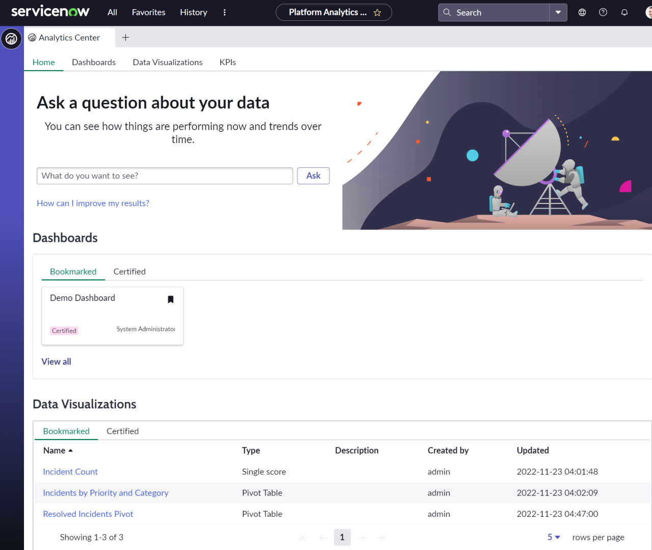
Platform Analytics Workspace
Responsive dashboards are superseded by Workspace Dashboards, providing two levels of customisation through its in-line or technical editor, and using UI builder for organisations that have more advanced dashboard requirements.
If you’re wondering whether this all means that reports and responsive dashboards are no longer available, don’t worry, they are. You’re still able to create and view reports and dashboards just like you could do before, but if you want to start benefiting from Platform Analytics Workspace, you’ll need to begin thinking about when your organisation will adopt these features, and how you can transition.
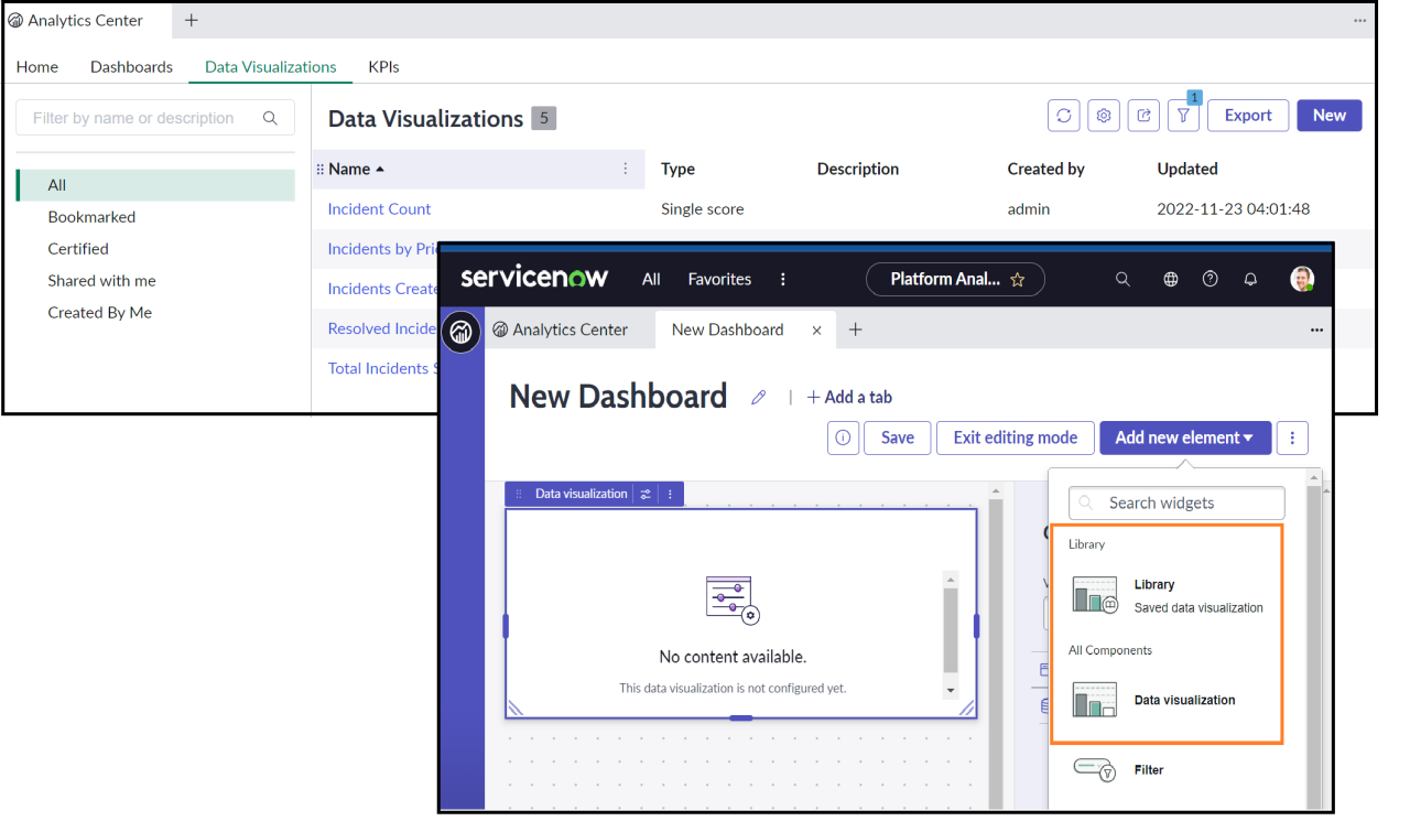
2. Visualisations can be configured as part of the library or as part of a dashboard
A common frustration that we hear from our customers stems from the user experience that requires reports to be built separately to the dashboard.
Next Experience has made some vast improvements with the ability to create standalone visualisations that can sit in a library and be re-used across multiple dashboards, but also the ability to create a visualisation on-the-fly within a dashboard itself. You can even add a library visualisation and make modifications to create a local dashboard version of it with ease.
Consequently, dashboard creation becomes much slicker with the ability to apply dashboard permissions across different visualisations within the dashboard.
Data visualisation library and the addition of dashboard elements using a saved or adhoc visualisation
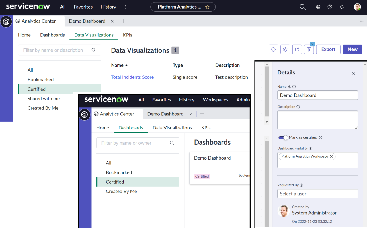
3. Visualisations and Workspace Dashboards can now be certified
The self-service model within ServiceNow is an important one, and is typically supplemented with official content created by central reporting teams. Until now, it’s been difficult to tell these apart. A typical report consumer may have a report shared to them, but it could have been created by another person that didn’t truly understand the data and may have missed an important filter. How do we distinguish between user generated reports and those that are deemed to be official?
Next Experience introduces the certified feature. This allows central reporting teams to create content that has been thoroughly designed, checked, and tested. Report consumers can feel assured in being able to quickly identify visualisations and dashboards that have the certified flag against them.
Example screenshots of the certification process and how these display within Analytics Center
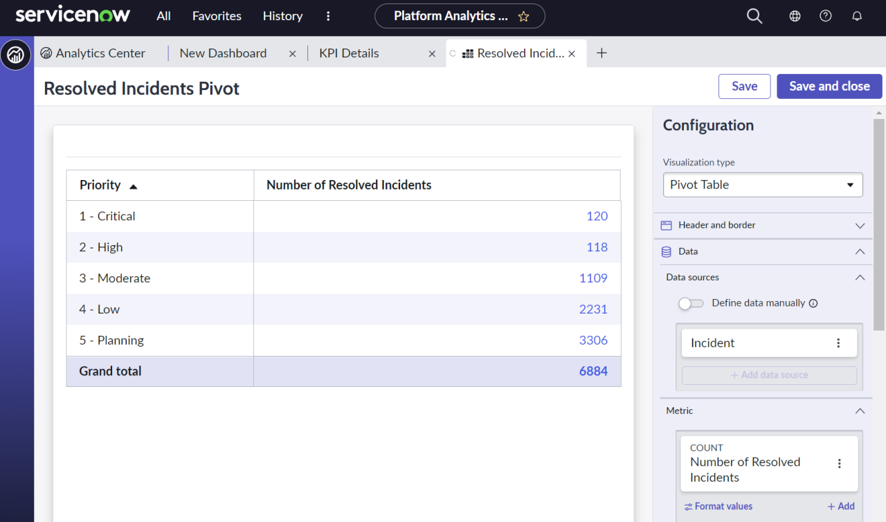
4. Pivot Table Visualisation Enhancements
Significant improvements to the pivot table functionality have been made. The equivalent functionality within classic UI reporting meant that when creating multi-pivot tables, you were forced to include group by rows and columns (even if you didn’t have a column grouping requirement).
The new pivot table visualisation allows tables to be configured that are just grouped by rows, columns, or both. The metrics produced can be relabelled to create more professional and cleaner looking results.
Example pivot table with single metric, grouped by rows
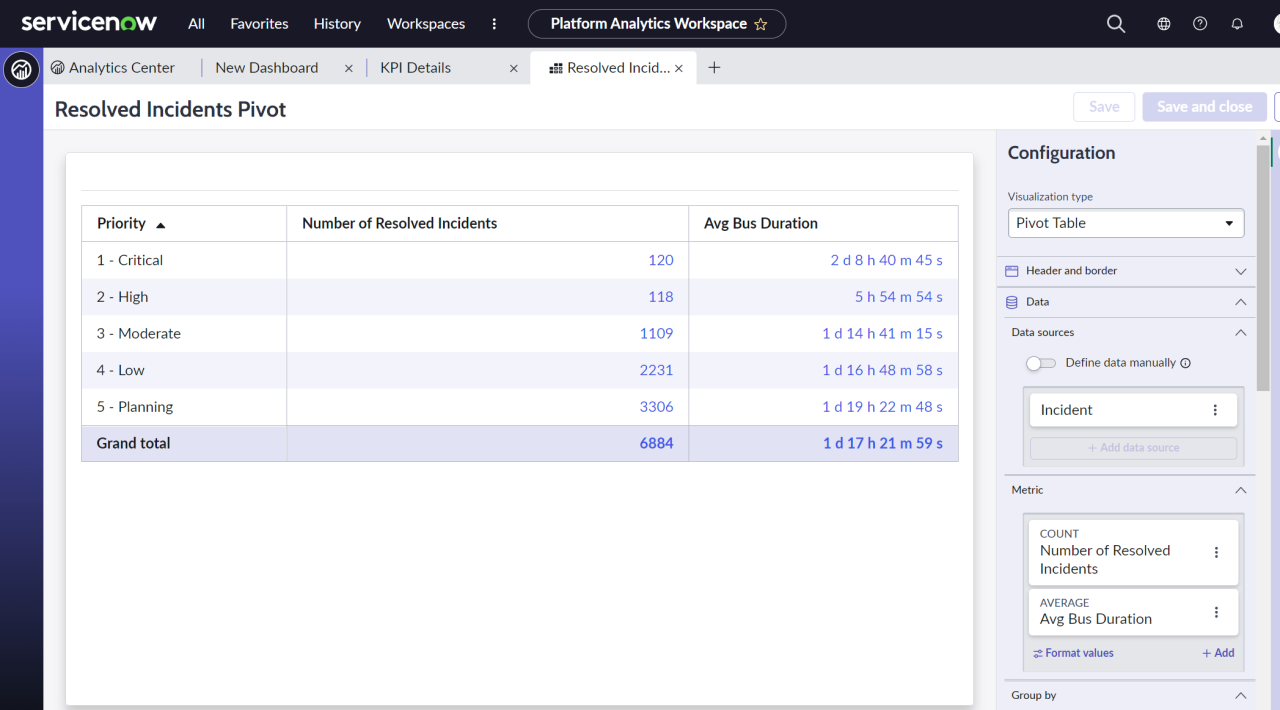
A new ‘Metric’ feature has been added, allowing more than one aggregated result to be returned. If, for example, your data source is focused on “resolved incidents,” you can now achieve tables such as the one below that not only show a metric for the volume, but also other associated results such as average duration (providing they can be calculated from the same source data set).
Example pivot table visualisation showing multiple metrics
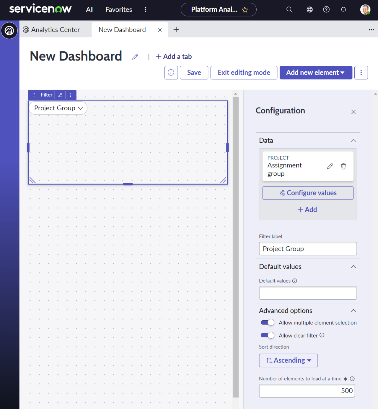
5. Dashboard filtering becomes simpler
To filter a dashboard that contains reports, you would need a technical team to first interactive filters that can be made available.
New workspace dashboard filters allow you to add a new filter directly from the dashboard itself, indicate the field that you want it to map to, and add it to your dashboard without leaving the user interface.
When it comes to PA Indicators, these filters now attempt to automatically map themselves to breakdowns without the need to complete additional configuration steps.
Example dashboard filter configuration
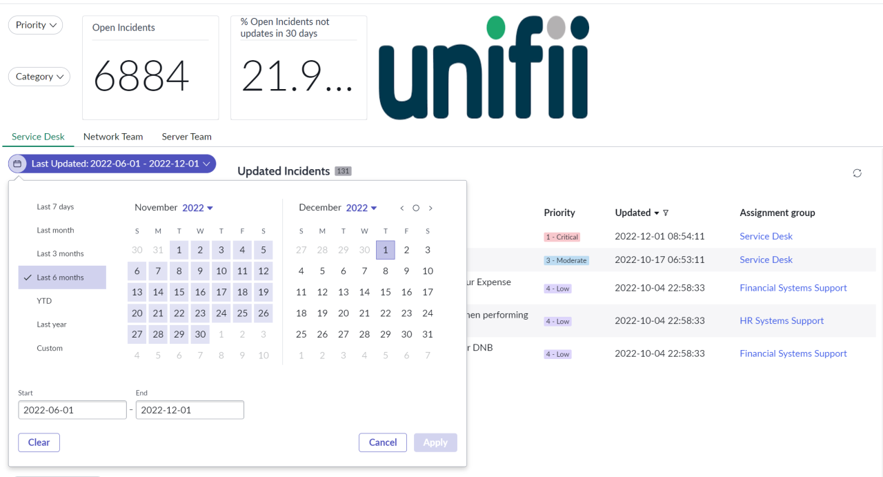
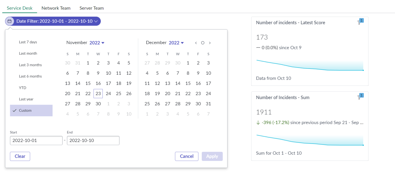
6. Date Filtering Improvements
Filters can also be added and quickly mapped against date/time fields such as your records created, closed, or updated date. The interface for the date filtering is much improved, but for non-PA visualisations, considerations still need to be made on how these are best applied - especially if you’re aiming to display different themes of data on a single dashboard such as logged vs resolved. Date filters still need to be mapped to a specific field on the source tables.
Example date filter applied to a non-PA based visualisation
When using PA based visualisations, the date filtering capability provides a significant enhancement over responsive dashboards.
Each visualisation provides an option for how date filters should be applied with the ability to display the latest score, a sum, or an average across the selected period. These filters apply to the data associated with the scores table results.
In the example below, you can see how a date filter can change the outcomes of two different visualisations that use the same indicator data source.
Example date filter applied to a PA based visualisation
7. Dashboard Header Customisation
Within responsive dashboards, the header is reserved solely for breakdown filters so that they can apply across tabs. Workspace dashboards now open the header so that it can be used to solve different use cases that your organisation may have.
This means that multiple filters can be added to this space, providing better crosstab support of the visualisations and a much-needed improvement on the previous restriction (which meant that only one PA breakdown could be applied at any given time). This expansion now enables two breakdowns to be filtered (the maximum supported combination today in the breakdown matrix), but you can add more when working with non-PA based visualisations.
The improvements also mean that other element types can be added. Perhaps you’d like to add an image to the header, or you need to add multiple visualisations, with further breakout within the tabs. You could even enlarge the size of the header to introduce a tabbed footer style design.
Dashboard example with advanced header control
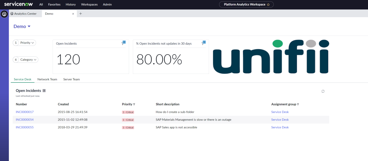
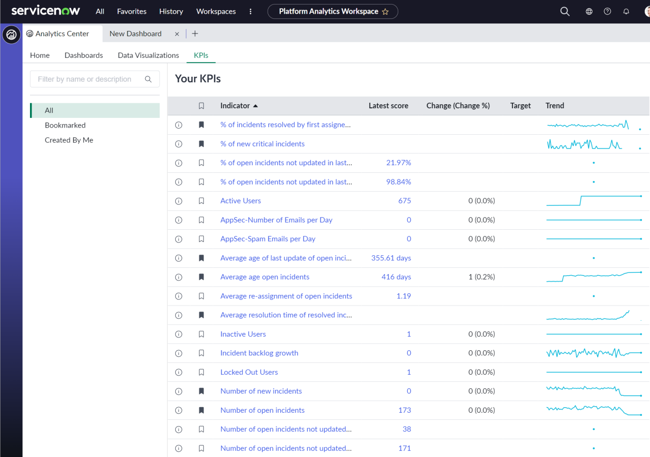
8. KPIs in one place
The classic UI created a space for Performance Analytics Indicators using Analytics Hub, but while being powerful, it was tucked away and not always in the forefront of the platform. You may have even only accessed it as part of a responsive dashboard drill down.
Analytics Center brings more attention to your KPI’s and with the ability to bookmark them, you can focus on those that are important to you from the Platform Analytics Workspace.
KPIs tab within Analytics Center
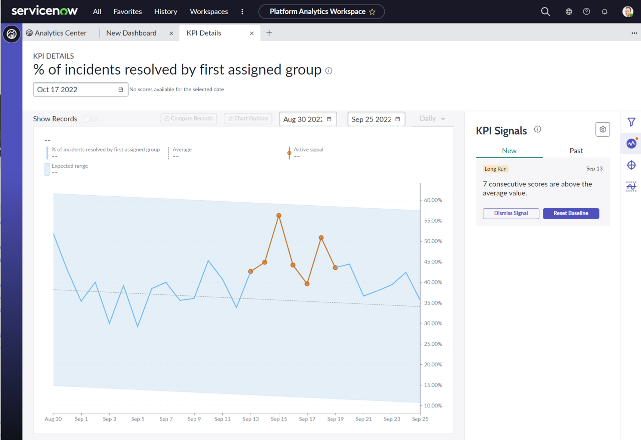
Clicking through to any of the KPI’s will take you through to KPI Details, which provides a similar level of detail to what you may have been used to within Analytics Hub. However, new features such as KPI Signals also exist in this space that can help to alert you to sudden changes within your process in comparison to your baselines.
KPI details showing the detection of a long run KPI Signal
9. When should we adopt and migrate to Next Experience Platform Analytics?
The Tokyo release has brought through some core enhancements to reporting within the platform, and the product management teams at ServiceNow are continuing to further invest, evolve and enhance.
It’s important to mention that not all features that exist within the classic UI have yet been replicated. For example, you won’t find cascading filters or PA Workbench widgets there (yet).
Both ServiceNow and Unifii recognise that there will be a journey that will see organisations be able to move to the new features, especially those that are heavily reliant on reports and responsive dashboards. We predict that we’ll start seeing more features coming within future releases, such as conversion tools. Perhaps, also the ability to add classic UI report widgets to workspace dashboards to help make that journey for our customers easier, although this is yet to be officially confirmed by ServiceNow.
Just like the transition of homepages, this is a journey that will likely take some customers years to fully adopt. Your organisation may be at a point where you can adopt the features immediately with the Tokyo release, or you may be at the stage where you need to see the solution mature further with additional features such as migration tools.
Wherever you are in your journey, it’s essential to start thinking about where Next Experience fits into your reporting strategy. Our teams work closely with ServiceNow product managers to review new features and feedback, and help evolve the platform further.
Get in touch with us today here if you’d like a demo of the new features, and to discuss the path that your organisation might take to adopt them.